A User's Journey into DEVONthink: The Future

(yes, ‘one app to rule them all’ again…)
The following are some thoughts on what I think could be added to or improved in DEVONthink Pro Office (DTPO) or DEVONthink To Go (DTTG2). From this series of blog posts you will have guessed that I am a big fan of this software. It has genuinely made life so much easier for me (especially academically) and even after a good few months of daily use, some of the features I come across still surprise and delight with their simplicity and logical manner! Still, anyone using a piece of software to this extent will occasionally think ‘I wish it did this’ or ‘wouldn’t it be good if’, so here is my collection of those moments.
Reader-style view in built in browser — I love the macOS/iOS reader view. It does an amazing job of stripping the junk out of a web page so that I can actually read, review, and annotate it, yet keeps the useful stuff like metadata, source, and embedded links. I wonder if this is what web-based documents on the very early internet were like before the advertisers got their paws on it (yes, exactly — the editor)!? Anyway, currently I have to navigate out of DTPO to Safari to get my fix. It’s only a few clicks, but is a bit of a chore.

Readability or similar integration with built-in browser for RSS feeds — I see a lot of items imported from RSS feeds are ‘HTML’ items. These display as a single line of text in the built-in browser and I need to click on the link in the address bar to go out to Safari to read anything more than that. If I go use Reeder however, I get the same single line summary, but I can hit the Readability add-in button and get a distraction free version of the full story right there. If this could be done in the DTPO browser, a distraction-free version could be automatically imported.
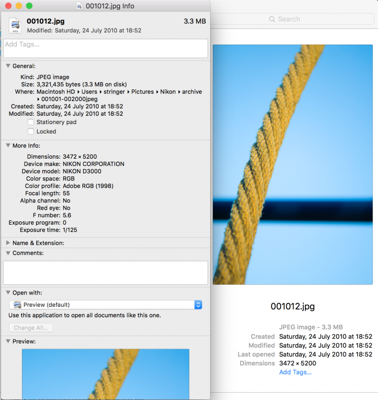
Pulling of further metadata on import (e.g images shot with DSLR) — I know this is a complex issue. There are about a billion (guessing) different types of metadata out there and people may want DTPO to pull in any one of them. I suppose this could be approached in terms of prevalence: DSLR and music file metadata must be a pretty common requirement, and would allow the user to search and categorise by lens, f-stop, exposure time, or album, year, artist, etc. to curate sets of images or music. This is just one example though.

Ad blocker on built in browser — Yes I’m looking at you National Geographic! Advertising on the net is annoying enough anyway, but I’ve found on certain sites it take up most/all of the DTPO browser window, obscuring the actual content. Ads on websites are not something that DEVONtech have any control over, of course, but an ad block extension would go some way to mitigating it.
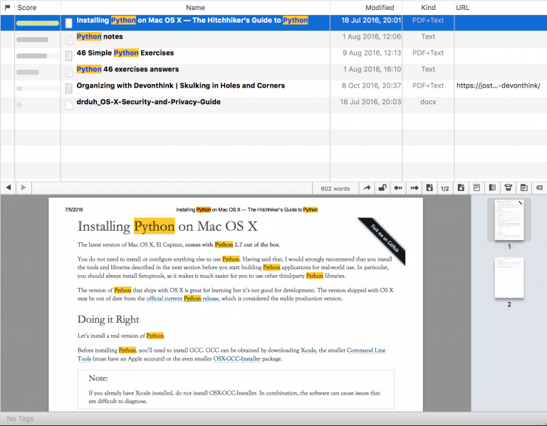
Search highlights in opened document — If you enter a search term in the basic search box, you can see and browse that term (highlighted) in the preview window (using the next/previous highlight arrows) when you select the document with a single click, all from the DTPO main screen. What you can’t do (I think I am right in saying) is use Command-Shift-F, search, and then open a document with highlighted instances of the search term. Having said that, you CAN use Command-Shift-G to scroll through instances of the search term in the opened document. So perhaps this one would only come down to linking this function to the next/previous highlight arrows to bring it in line with the preview window.

A similar feature to ‘Scrivenings’ mode — If you have used Scrivener, you will know this one. Turn it on in the app, enter a search term, and Scrivener pulls together all the text from inside your documents displaying that term, and presents it in a single rolling window. I’ve found this very useful in the past for cutting through large research documents or written text to quickly get a summary of everything concerning ‘search term’.
Finally a small one — What if the DTPO main window could automatically go back to the original size once the See-Also/Classify sidebar is closed? At the moment this has to be done manually after the main window is shrunk to open the sidebar. It’s a tiny thing but it bugs me a bit!
It would be great to hear what others think on these and any other ideas, so over to you! This is the part where you tell me I can do almost everything above already and just haven’t found it yet! And of course, outside the scope of this article, when you start to think of the possibilities for this software once AI and VR/AR really gets going…
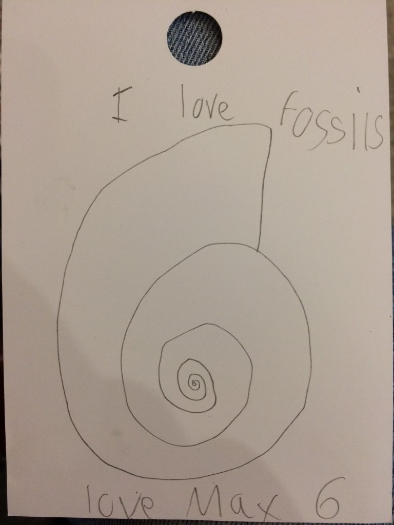
So now it’s over and out. That’s it for this series of articles. I’ve enjoyed writing these and using DEVONtechnologies products immensely over the course of the series, and want to thank the developers and the team for hosting my ramblings on their site. I’m looking forward to many more years of use, and I’ll leave you with this final image.
Stuart Ingram

Note: This article deals with an older app generation. Interface elements, menu paths, and procedures could differ.
